
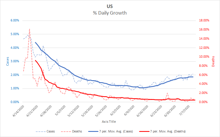
Growth has been largely as anticipated over the last few days. Our actual case counts are only slightly below the last projection I ran. There are two changes to the growth patterns that may seem small at this point but that could have a large impact depending on how they develop. Before I get in to those, I want to call out a change to how I’m presenting graphs today. To this point, I have been using solid lines for the actual numbers and dotted lines for the trendlines. I’m reversing that today to make the trendlines more salient. The graphs have all this labeled, but it’s worth pointing out the change.
First the acceleration in the growth rate of cases has slowed down a bit. We are still growing exponentially, but the “exponent” part of that growth isn’t accelerating as quickly. In the last week, we’ve gone from growing an average of 1.78% per day to growing an average of 1.86% per day, a change of 0.08%. But in the week prior to that we went from an average of 1.51% to an average of 1.78%, a change of 0.27%. Essentially, we’re still accelerating, but we’ve let off the accelerator a bit. You can see this in the first graph as the blue line flattens some on the right side. Remember that this is a graph of how fast we’re accelerating, not how fast we’re growing. Even a flat line on this graph represents an exponential increase in cases.
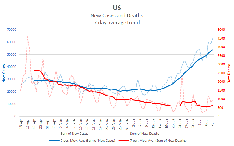
Second, it looks like our national daily deaths have started to increase. The data isn’t entirely conclusive on this, but I think there’s enough to warrant the claim. Several states have had increasing death rates for a while. Florida, for example, has seen increasing deaths since mid-June. Recently many more states have either started increasing or stopped decreasing on this metric, just as they earlier started increasing in cases. These changes in the states are beginning to show up in the national numbers. You can’t really see it in the previous graph, so here is a graph of the national numbers. I’ve removed New York and New Jersey as they each had an anomaly in reporting deaths that can be confusing.

You can see the bump at the far right of the red line indicating increases in deaths. That bump is only three days of reporting, so it’s worth wondering whether it’s real or just noise. There are a couple of reasons to think that it’s real. First, it’s pretty large compared to the noise in the rest of the line. There is a similar bump after Memorial day that now looks like noise, but this bump is significantly larger. Further, this is a change we’ve been expecting and it’s happening within the window we expected to see it. Death lag cases by three to four weeks – the average amount of time it takes a fatal case of COVID-19 to progress from infection to death. National daily case numbers started rising on June 12. The bump in deaths starts on July 2, just 27 days later. So, because of the size and the timing, I’m willing to bet this is the start of a period of increasing daily death numbers.
Here’s the national graph with New York and New Jersey added back in, just so that everyone can see the full data. Note that adding them in changes the scales on both sides.
There are a couple of things to note in the differences between the graphs with and without New York and New Jersey. First, you can see the two spikes in deaths near the end of June in the version with the two states in it. Those were times when the states added in a backlog of deaths. They were merely recording deaths that had occurred earlier, so it’s not fair to look at them as representing a change in the overall growth rate. Second, compare the blue lines during the month of May. In the graph without the two states, the line is pretty much flat. In the graph with the two states added back, that line is decreasing. So what seemed to be decreasing numbers through the month of May were really just decreases in the two states that were hardest hit in April, the rest of the country was not improving. There’s a good question about why deaths decreased in the rest of the country during May while cases remained flat. My best guess is that it represents improved treatment and better equipment as we learned more about the virus, but that’s just a guess.
So, I’ve gone out on a bit of a limb in saying that the last three days represent the start of a trend. We’ll see if that limb gets cut off underneath me over the next week. In the meantime, here’s a projection for the next 10 days. Having recently reached the 3 million threshold, it should take about another week for us to reach 3.5 million.
| Day | Cases | Deaths |
| 7/9 | 3,117,794 | 133,287 |
| 7/10 | 3,177,032 | 134,010 |
| 7/11 | 3,237,396 | 134,734 |
| 7/12 | 3,298,906 | 135,458 |
| 7/13 | 3,361,585 | 136,182 |
| 7/14 | 3,425,456 | 136,906 |
| 7/15 | 3,490,539 | 137,629 |
| 7/16 | 3,556,859 | 138,353 |
| 7/17 | 3,624,440 | 139,077 |
| 7/18 | 3,693,304 | 139,801 |
| 7/19 | 3,763,477 | 140,525 |