
The central point of my post on Monday was that the states with rising numbers were accelerating in such a way that their daily increase would soon outweigh the daily decrease in non-rising states, and that as a result the national numbers as a whole would soon begin to rise. There is some evidence in the data that this has now happened.
The evidence comes from looking at the 7 day average of the percentage growth rates for each group and for the nation as a whole. This is the same type of data that we looked at on Monday. One of the nice things about this measure is that it isn’t very noisy – it doesn’t change direction a lot. Daily case numbers go up and down a lot. For example every Sunday is lower than the Thursday before it and the Thursday after it. This is what gives the daily case graph their familiar up and down zig zag pattern. If we’re interested in whether the numbers are rising overall or falling overall, that up and down pattern is noise. Knowing that the numbers fell from Thursday to Sunday, or rose from Sunday to Thursday, doesn’t tell us anything interesting about whether cases are generally rising or falling. The amount of change in the weekly cycle overwhelms the amount of change from week to week, making the latter harder to see.
By looking at the 7 day average, we cancel out a lot of the noise in the weekly cycle. It’s not perfect, because the weekly cycle isn’t perfect, but it makes it a lot easier to see the general trend. This is the dotted line in graphs such as this one:
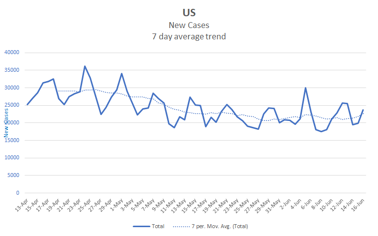
The dotted line shows the general trend more clearly than the solid line does. It still isn’t fully smooth, it still goes up and down a bit, but it’s a lot smoother than the solid line. Just how smooth a line you want depends on what you’re looking for. If we were interested in the correlation between the number of tests on a given day and the number of new cases found that day, then we might not want to smooth the line at all. Because we’re interested in longer term trends, we want a line that doesn’t bounce back and forth much. Ideally we want a line that only changes direction when there’s a longer term shift and not just because there was one day with a particularly high or low count. That’s what we get by looking at the 7 day average of percentage growth rates. Here’s a graph with both the daily and the 7 day average percentage rates for the nation.
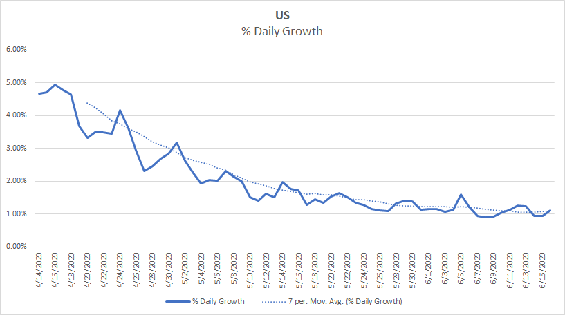
The dotted line in this graph is even smoother than the one in the previous graph. Over the period from April 19th to June 12th there is only one day that isn’t a smooth transition between the day before and the day after in the 7 day average line. Except for that one day, the line represents a consistently decreasing trend. With that one exception, every day is no higher than the day before it. However, since June 12 the line consistently rises – every day since then has been at least as high as the day before it. Given how smooth this measure has been up to this point, this looks like a change in the longer term trend. It’s possible that it will start trending down again tomorrow, but I don’t expect it to.
My reasoning is much the same as it was on Monday – the rising states are rising faster than the others are falling. Some of this is just based on the underlying math. A state’s daily cases can rise as high as its population, at least in theory, but can’t fall below zero. If one group of states is rising and another group is falling over a long enough period, then the rising states will rise more than the falling states can fall. However, another part of my reasoning is based on the way the virus spreads. Viruses want to grow exponentially, to snowball, until they saturate the population. This virus is a long, long way from saturating the US. Keeping it from snowballing requires exerting constant pressure on its growth rate by social distancing, wearing masks, and similar activities. As we do less of that, we expect more growth. Over enough time, growth will overcome any gains we have already made. To prevent that, we have to actively do something to decrease the spread – social distancing, contact tracing, vaccinations, … something. Even the most optimistic predictions for a vaccine don’t have it available for several months from now and there doesn’t seem to be much appetite for social restrictions, so my best guess is that we’ll see continued growth until the numbers get too high to ignore. Once we decide to take action, it will take at least another month to bring the numbers down. So I expect this next phase to last at least through the end of August and likely well into the fall.
There is some good news, though. It looks like there is a good chance that they have found an effective treatment for some of the worst outcomes of COVID, those that require the use of oxygen or a ventilator. The drug is Dexamethasone, and a steroidal anti-inflammatory. To be clear, this isn’t a treatment for the virus itself, it’s a treatment for the specific types of respiratory problems that the virus can cause. It is of no use in preventing these problems and might even be harmful if used before they occur. However, it’s widely available and not expensive, so it could go some way toward reducing the fatality rate. You may have seen headlines about this, but if you want a little deeper look, here is Derek Lowe’s take on it.
Finally, here is a projection for the next 10 days. I decided not to make any adjustments based on anticipated growth, so my expectation is that this will end up being a bit low over 10 days. However, I don’t expect the differences to be large over that time frame.
| Day | Cases | Deaths |
| 6/16 | 2,137,579 | 116,960 |
| 6/17 | 2,159,527 | 117,614 |
| 6/18 | 2,181,478 | 118,269 |
| 6/19 | 2,203,430 | 118,924 |
| 6/20 | 2,225,382 | 119,579 |
| 6/21 | 2,247,333 | 120,234 |
| 6/22 | 2,269,285 | 120,889 |
| 6/23 | 2,291,237 | 121,544 |
| 6/24 | 2,313,188 | 122,199 |
| 6/25 | 2,335,140 | 122,854 |
| 6/26 | 2,357,092 | 123,509 |
Be safe, and do whatever you can to help slow the spread in your own areas.