
Analysis
It’s not entirely clear yet, but I think we’re beginning to see the national case numbers rise. Here’s a graph to help me explain why. I’ve added lines indicating the change in the weekly peaks and valleys.
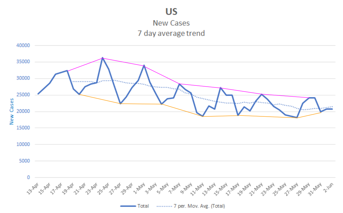
As you can see, the peaks have gotten lower each week since late April. The valleys have followed a similar pattern, though with less decrease overall. Starting in early May, we see a change in the pattern. The peaks begin to decrease more slowly and the valleys stay at basically the same level. In the last cycle we see valley actually rise while the peak has the smallest decrease in the series.
Next, note where we are in the cycle. Throughout the graph, valleys have occurred mostly on Mondays, a couple of times on Sunday, and once on Wednesday after a long holiday weekend. We’re at Wednesday after a valley on Sunday. If the pattern continues largely as it has, we should see rising numbers for the next few days. From that point, it will be very difficult to continue the weekly cycle without the peaks also rising. When peaks and valleys are both rising, the numbers as a whole are rising. In fact, the wider valley we see last week exactly corresponds to low testing numbers just after Memorial Day. Had testing occurred at the usual rate on those days, we would likely have seen the rise begin earlier. Here’s a chart.

So, provisionally, I think the numbers are beginning to rise. It remains to be seen how the protests will affect testing rates. If testing rates are suppressed, then case numbers may not rise as expected.
States
Let’s see how the states are doing individually. On Monday I grouped the states based on whether their cases were rising, falling or steady/unclear. Today I’m only going to briefly comment on those that seem to have changed categories since then.
Massachusetts – from Falling to Unclear. This is due to a large spike (5x normal) in reported cases on June 1.
New York – from Falling to Steady. It’s probably still falling a little, but the rate has slowed enough that I count it as steady.
North Dakota – from Falling to Unclear. While it has dropped from its high point, the last week seems more steady than falling. There are some anomalies in the data that make me list it as unclear.
Oklahoma – from Falling to Unclear. There’s a lot of noise in the data making it hard to see a clear trend now.
Texas – from Unclear to Rising. The running average has been rising steadily. The three highest days overall for Texas have been in the last week. Last night’s numbers were more than twice the previous Tuesday’s.
Virginia – from Rising to Unclear. After a spike on the 25th and 26th, the number have fallen back to roughly the previous range. We’ll have to see what happens next.
Wisconsin – from Rising to Unclear. There are large swings in the data. It may have leveled off overall, but it’s too soon to tell.
All of the other states are in the same category as before. If anyone wants to see a graph for a particular state, let me know.
Projection
Here’s what the next 10 days may look like. I think the protests throw some added uncertainty into this largely because they may impact testing rates.
| Day | Cases | Deaths |
| 6/2 | 1,827,466 | 106,026 |
| 6/3 | 1,851,516 | 107,001 |
| 6/4 | 1,874,424 | 108,008 |
| 6/5 | 1,897,333 | 109,016 |
| 6/6 | 1,920,242 | 110,023 |
| 6/7 | 1,943,151 | 111,030 |
| 6/8 | 1,966,060 | 112,038 |
| 6/9 | 1,988,969 | 113,045 |
| 6/10 | 2,011,878 | 114,052 |
| 6/11 | 2,034,787 | 115,060 |
| 6/12 | 2,057,696 | 116,067 |
Stay safe, and don’t be racist.