The national numbers are still in a space where they can be read in different ways.
The clearest signal comes from the data on deaths. At least until a week ago, deaths were declining. Since that time they seem to have flattened. It remains to be seen whether that flattening will hold. However, given that the new case rate started flattening about two weeks earlier, I would expect that deaths will remain more or less flat for the next two weeks. Deaths lag cases by about two weeks as on average it takes about that long for someone to die from the disease.
Data regarding the new case rate is less clear. There was a clear change from decreasing to mostly flat about three weeks ago. Since that time the rate could be read as flat, slightly decreasing, or even changing to an increase. I am including three graphs with trendlines showing each of these interpretations.
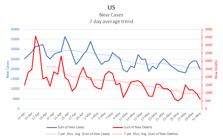
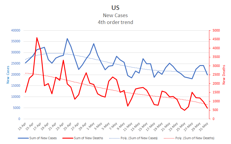

It’s a judgment call as to which of these fits the data best. I tend to prefer the 7 day moving average trend, but I couldn’t really fault someone who thought the others were better. Because of the ambiguity here, you may see stories with conflicting conclusions. One author may sincerely see decreasing numbers where another sees increasing numbers. In any case, if there has been a decrease or increase in the rate of new cases, it is small.
Of course, the cumulative numbers are still climbing, that’s all that cumulative numbers can do. They can rise faster or slower, but they will always rise. The raw numbers of new cases and new deaths determine how quickly the cumulative numbers rise. By looking at whether new cases are themselves rising, steady, or falling, we’re trying to see whether the rise in the cumulative numbers is accelerating, holding steady, or slowing down.
States
On a state by state basis here’s how things break out. I’ve separated states into three groups, those that have clearly rising new case numbers, those whose new case numbers are clearly falling, and those whose new case numbers are steady or unclear. Keep in mind that states with low daily numbers can show a clear rising trend with just a few days of what other states would consider extremely low numbers. Alaska and Montana are good examples of this.
Clearly Rising
Alabama, Alaska, Arizona, Arkansas, California, Mississippi, Missouri, Montana, North Carolina, Oregon, South Carolina, Utah, Virginia, Washington, Wisconsin
Clearly Falling
Connecticut, Delaware, District of Columbia, Illinois, Massachusetts, Michigan, New York, North Dakota, Oklahoma, Pennsylvania, Rhode Island
Steady or Unclear
Colorado, Florida, Georgia, Hawaii, Idaho, Indiana, Iowa, Kansas, Louisiana, Maine, Maryland, Minnesota, Nebraska, Nevada, New Hampshire, New Jersey, New Mexico, Ohio, South Dakota, Tennessee, Texas, Vermont, West Virginia, Wyoming
Models
We’re interested in how the numbers have behaved so far because we want a view into how they are likely to behave in the future. The simplest way to do this is to assume that the numbers will continue to behave in the future as they have in the past. This is essentially what I have been doing, just projecting current trends 10 days into the future. This technique works pretty well as long as you 1) are dealing with something that doesn’t change suddenly, and 2) not predicting very far into the future. Fortunately, both these conditions are met. Here’s my projection for the next 10 days.
| Day | Cases | Deaths |
| 5/31 | 1,785,981 | 104,229 |
| 6/1 | 1,807,959 | 104,870 |
| 6/2 | 1,830,366 | 105,511 |
| 6/3 | 1,852,773 | 106,152 |
| 6/4 | 1,875,180 | 106,792 |
| 6/5 | 1,897,587 | 107,433 |
| 6/6 | 1,919,995 | 108,074 |
| 6/7 | 1,942,402 | 108,715 |
| 6/8 | 1,964,809 | 109,355 |
| 6/9 | 1,987,216 | 109,996 |
| 6/10 | 2,009,623 | 110,637 |
Notice that my method doesn’t require any knowledge of the virus or social behaviors except that they change smoothly rather than erratically. More sophisticated models do use what we know about social behavior and the virus to try to estimate numbers farther into the future. If you want to see what those models are predicting over the next month, there’s an excellent summary page at https://projects.fivethirtyeight.com/covid-forecasts/ . Here’s a picture showing their forecasts for June 6.
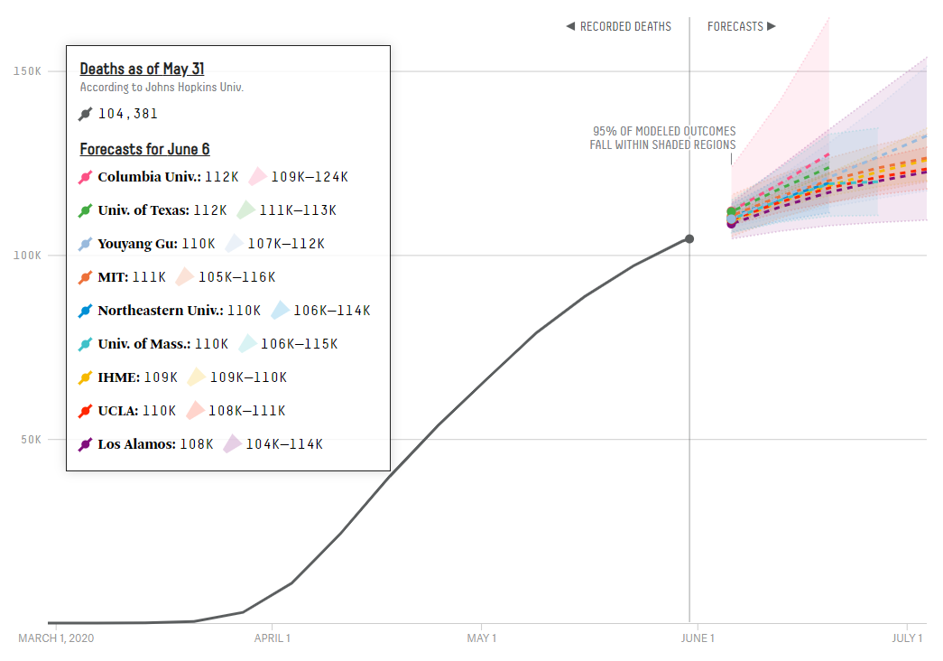
Their prediction for cumulative deaths on June 6 range from a 105,000 to 112,000. My prediction of 108,000 fits nicely within that range. For June 20, their models range from 117,000 to 127,00. My technique would yield 117,000, right at the low end. As long as things are pretty steady, both techniques work fairly well. However, the more sophisticated techniques work better when things change suddenly. Consider the recent protests as an example. It’s possible that widespread protests can function as super spreading events. While they are outside, there are thousands of people in large groups over an extended period of time. The physical exertion of protesting likely increases aerosolization of the virus, furthering it’s spread. My technique can’t adapt to these possibilities, I just have to wait to see the data in two weeks. However, models that include the role of social behavior on viral spread can make reasonable predictions about the effects of suce events. Not all models include the right variables to do this, so it’s worth knowing a bit about any model that you follow so that you can better interpret its predictions.