
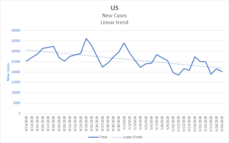
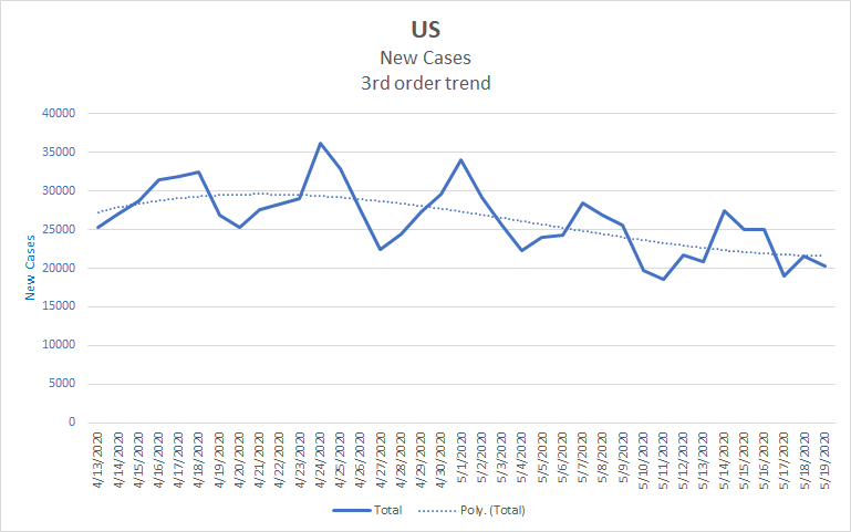
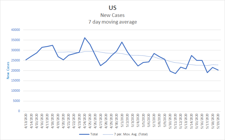
We’re still in the doldrums waiting for a clear sign on the effect of reopening. This at least means that reopenings have not caused immediate surges. However, there are some indications of rising numbers, though they aren’t yet conclusive in general. Overall, it’s too soon to tell.
There are a few clear cases. Texas started to rise about the time it started to reopen and has continued to do so since then. Colorado has continued to fall despite some reopening. Florida has gone from decreasing to increasing. But there isn’t a clear signal for the nation as a whole. Part of this is due to the different circumstances of each state. Texas’ reopening plan is not the same as Colorado’s and the populations in each state react differently.
This is also an opportune moment to remember that we’re looking at reported numbers rather than actual infections. Florida and Georgia were among the most aggressive reopening states and both are under allegations of data manipulation to support their reopening decisions. The allegations against Florida are specific enough to be worrisome. Of course, none of this is settled – allegations aren’t proof of malfeasance. Nonetheless, it’s something to keep an eye on and a reminder to take the numbers provisionally rather than as absolute truth. I’m sure we’ll see an increased focus on excess mortality – the number of people who die above what is normal for the season – going forward. We won’t know what the real numbers are for at least a year. This isn’t unique to COVID, it happens with the flu also. If you look at the CDC’s page on the most recent flu season you’ll see that the numbers are estimates. Later they’ll compare the data they have against other data sources and come up with a clearer picture of the actual numbers. Part of that process will be trying to tease apart deaths from COVID vs influenza as the two diseases can present similarly. Unfortunately, we need to make decisions now, so we have to work with the currently available data even if it is flawed and noisy.
My best read of the national numbers is that our overall decline has slowed or perhaps stopped. Still, it depends a bit on how you squint. The only thing that’s clear is that we’re not declining faster. Here are a number of graphs with different trend lines, I leave it to you to decide which is the best fit. You can compare your selection to what actually happens over the next week and see how your guess was.


Projection
We seemed to be aimed at 1.8 million cases and a bit over 100,000 deaths by the end of May.
| Day | Cases | Deaths |
| 5/19 | 1,528,568 | 91,921 |
| 5/20 | 1,555,553 | 93,021 |
| 5/21 | 1,578,149 | 94,333 |
| 5/22 | 1,600,745 | 95,644 |
| 5/23 | 1,623,342 | 96,955 |
| 5/24 | 1,645,938 | 98,267 |
| 5/25 | 1,668,534 | 99,578 |
| 5/26 | 1,691,131 | 100,890 |
| 5/27 | 1,713,727 | 102,201 |
| 5/28 | 1,736,323 | 103,512 |
| 5/29 | 1,758,919 | 104,824 |
It’s weird to think of 5 or 6 thousand deaths as just “a bit”. Each is a life, a perspective, a hub to which many other people are connected. Social networks being what they are, it is likely that each of use will be only a few steps removed from some of those 5 or 6 thousand. The abstraction of statistics is useful and necessary, but so is remembering the rich lives that underlie the numbers.
Thanks for reading, and let me know which trendline you think best captures the data.