
Vaccines
We’re all waiting anxiously for a vaccine, and vaccine development is progressing with unprecedented speed. There are a number of promising trials at various stages. The Trump administration has set a goal of having widespread vaccination by the end of the year. Despite all this, it’s important to remember that meeting such a goal requires not only a Herculean effort but also for everything to come together perfectly on essentially the first try. So, while the goal is great, we will have to be very lucky to meet it. Even getting a vaccine approved by the end of the year would be an amazing feat, let alone having widespread availability at that time. Here’s an example of small things that can add delay
One of the two vaccine developments that is farthest along is from Oxford. They recently reported that their vaccine successfully prevented infection in Rhesus monkeys. As is common at the moment, they released the information in a non-peer reviewed preprint. But other scientists now have some concerns about the data. You can read a fuller account on Derek Lowe’s blog but the gist is that it’s not clear that the vaccine prevented infection rather than preventing symptoms – the vaccinated monkeys may have just become asymptomatic carriers rather than immune. This means that the vaccine can’t eradicate the virus, at least not at the dosages in the trial. Of course, the team can run another trial at higher doses, or trial multiple doses, but each of these adds to the timeline pushing the date of approval farther off. And, because these would require more vaccine to be produced, it would also lengthen the amount of time needed to produce and distribute enough vaccine.
This is just a minor speed bump in the scheme of normal research, but each of these speedbumps adds time to the overall process. The fact that these types of issues are so common in research and development is what makes many skeptical that a vaccine will be ready by the end of the year.
Slopes
I’ve done linear regressions over the last two weeks for each state, basically creating a trendline like this for Texas.
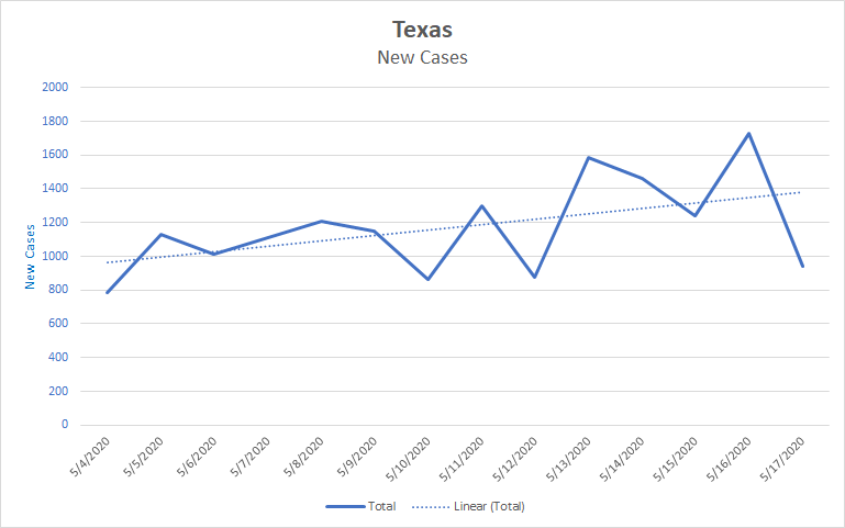
The slope of the trendline is how many new cases are added. The slope of this trendline is about 32. So, over the last two weeks, Texas has added about 32 cases per day on average.
Of the 50 states, 22 have positive slopes in their trendlines, though about half of those are very shallow. 10 states were increasing by at least 5 cases per day on average, they are: Texas (32), Virginia (17), North Carolina (16), Michigan (14), Florida (11), Louisiana (9), Arkansas (7), Wisconsin (7), Arizona (6), and South Carolina (5). In contrast, 14 states were decreasing by at least 5 cases per day on average: Ohio, Missouri. Kentucky. Illinois. Colorado, Indiana, Iowa, Massachusetts, Nebraska, Georgia, Kansas, Pennsylvania, New York, New Jersey. The last three were losing more cases per day than Texas was gaining.
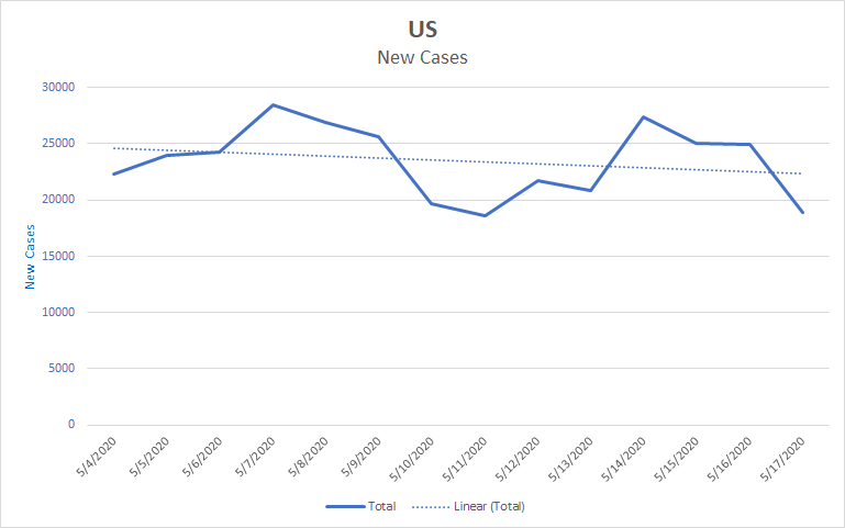
So, overall we have 10 states increasing, 14 decreasing and the rest more or less holding steady. The decreasers are outpacing the increasers. This is the situation that underlies the overall decreasing trend for the nation as a whole, shown in the next graph.
Projection
We’re in a period where what you see in the data depends a little bit on how you squint at it. For example, the next two graphs show the same data with two different types of trendlines. Have a look and see which you think fits the data best.
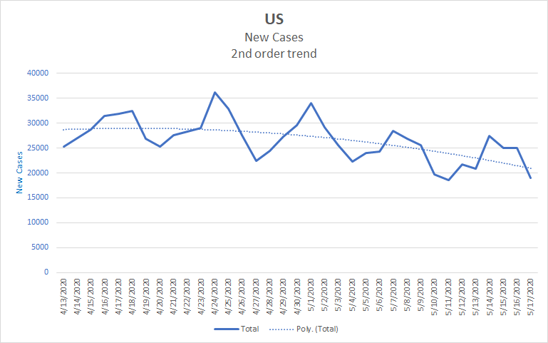
If you think the first one fits best, you’ll see a positive picture – the numbers are decreasing ever more quickly. If you think the second one fits best, you’ll see a negative picture – after a short decrease the numbers have flattened out and may be about to rise. And there are other trendlines that we could look at. Figuring out which story fits the data best can be a bit of a judgment call. In truth, we won’t know which of these stories is correct until we see what next week brings. So it’s a good idea not to take any one prediction too seriously. We’re pretty sure that new cases won’t plummet or skyrocket next week, but they might increase or decrease. The farther out we look, the greater the uncertainty.
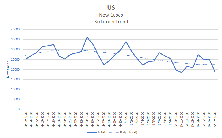
Here’s what the projection looks like. This is just how Excel projects the curve we’ve seen since mid-April. It’s not making any predictions about the effects of reopening or any other changes. We’re on track for over 100,000 deaths and about 1.75 million cases by the end of the month.
| Day | Cases | Deaths |
| 5/17 | 1,486,757 | 89,562 |
| 5/18 | 1,511,052 | 91,891 |
| 5/19 | 1,535,790 | 93,306 |
| 5/20 | 1,560,528 | 94,720 |
| 5/21 | 1,585,267 | 96,135 |
| 5/22 | 1,610,005 | 97,549 |
| 5/23 | 1,634,743 | 98,964 |
| 5/24 | 1,659,481 | 100,379 |
| 5/25 | 1,684,219 | 101,793 |
| 5/26 | 1,708,958 | 103,208 |
| 5/27 | 1,733,696 | 104,623 |
Thanks for reading. I’m happy to entertain questions in the comments.