
Daily case numbers at the national level seem to be cresting. The 7 day average has been within a 1500 point range for the last week. During this period, California, Florida, and Texas, by far the biggest contributors, have been flat or perhaps slightly declining. This is excellent news, though there are some concerns and caveats. Let’s start by looking at some graphs.
First, here are the national numbers. You can see the plateau in the blue line representing daily cases. There’s even a hint of a downturn at the end, though I wouldn’t put too much stock in that yet. It will take a few days to know whether that’s a real downturn or just a bit of noise.
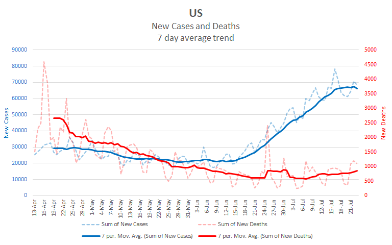
At the same time, notice that deaths are rising. We’ve had more than 1,000 deaths on each of the last three days. The last time that happened was in late May. Remember that deaths lag behind cases by about 2 weeks. So even if we are seeing a crest in the daily case numbers, the expectation is that daily death counts will continue to rise over the next two weeks. We don’t know how much they’ll rise, but the hope is that our increased knowledge and improved treatments will keep them lower than they were in April. However, our case counts are more than twice what they were in April, so we’ll have to wait and see.
Now let’s zoom in to the biggest three contributors: California, Florida, and Texas. You can see that the pattern in daily cases roughly matches that of the nation. Each of these states has approximately three times as many cases as any other state. Together they have been responsible for roughly 45% of the national daily case numbers. Each of them has roughly the same number of daily cases as New York did at its peak infection in April. It’s important to note that even if they have peaked, it will take longer for the cases to decline than it did for them to rise. Here’s the combined graph for the three states..

The most notable difference between the national graph and the one for CA, FL & TX is the rate of increase in daily deaths. Nationally, daily deaths have increased about 40% since early July. However, in these three states the daily deaths have increased about 150%, more than three times as much.
You’d be right to look at the two graphs thus far and think that as CA, FL, and TX get their numbers down, the national numbers will also come down. These are the three most populous states in the nation. Together, they account for more than one quarter of the total population of the US. It makes sense that they should have an outsized impact on the national numbers. However, there are reasons for being cautious about putting too much weight on this viewpoint.
First, there is a large group of other states that have high case numbers and are also rising. Let’s look at states that have averaged more than 1,000 cases per day over the last week, but less than the big three. (I’m leaving Arizona out of this group. While it does have more than 1,000 cases per day, its case numbers are declining.) While these states individually have lower populations than CA, FL, and TX, as a group they account for about another quarter of the US population. Here is their combined graph.

The thing to note is that they account for about ⅔ as many daily cases as the big three, but their case numbers are still rising. So even if the big three start to decline, there is a question of whether this group will rise more quickly than the big three decline. And of course, we’ve only looked at a total of 14 states with about half of the US population. A lot of the other states are also growing, though they haven’t yet reached the 1,000 cases per day average. So, while the national numbers are strongly influenced by CA, FL, and TX, even if these three decline, we may see another peak, or a long, high plateau as groups of other states continue to rise.
Second, a lot depends on how we as a society respond. In April, as soon as the numbers crested there was a big push to reopen the country. States such as Florida and Texas were among the fastest to do so. The drive to reopen was driven by a combination of fatigue and politics. All of us yearn to be back to “normal”, to be done with the whole social distancing rigamarole and back to visiting our friends and going where we please when we please. We’re dead tired of having to worry about this. I’m a natural hermit, and even I’m tired of it. That fatigue means that we are more likely to take any opportunity to relax our guard because keeping it up is difficult. On top of that fatigue, the virus has become a political issue. Especially with a major election in the wings, decisions about how and when to reopen are driven as much by our guesses at the effects on the polls as they are by our predictions of the effects on the virus. This is exacerbated by the fact that politicians have an outsized impact on regulations regarding restrictions and on the information conveyed to the general public. One need not ascribe ill intent to the politicians to see how this could have negative results.
So the upshot is that yes, we appear to be at something of a crest in the daily case numbers, though daily deaths are rising and will probably continue to rise for another couple of weeks. But this crest is fragile and tenuous. If we don’t, as an entire nation, follow through on efforts to contain the virus, the crest will be at best a long plateau and at worst a short breather before even higher levels. Remember that fall is coming, and with it comes the flus and infections that we see every year as we increase our time indoors. All of these put added stress on our medical systems. If that stress is added to already high COVID19 numbers, it may lead to worse outcomes across a range of diseases. The virus didn’t go away during the summer, but that doesn’t mean it won’t get even worse in the fall.
Finally, I want to add some perspective to the current numbers. Most of my charts start in mid April. The reason for this is simply that Johns Hopkins University changed the structure of the data set about then and it’s just easier to not mess with the older structure when I don’t need to. Since I’m mostly interested in how the epidemic is changing, I don’t often need to look at what happened in March. But we need to not lose sight of how our current circumstance compares to what we see in a longer view. So here is a graph starting in early March. Remember early March? It was back when the virus was just a worry and not something that impacted our daily lives.

That first rise and crest look pretty small when put against where we are now. The big worry is that we will become complacent, and the next rise will dwarf this one. It’s up to us to not let that happen. We can’t confuse making progress with having already won the war.
With that, here is what the next 10 days may bring.
| Day | Cases | Deaths |
| 7/23 | 4,038,596 | 144,301 |
| 7/24 | 4,108,904 | 145,418 |
| 7/25 | 4,179,490 | 146,536 |
| 7/26 | 4,250,076 | 147,653 |
| 7/27 | 4,320,661 | 148,770 |
| 7/28 | 4,391,247 | 149,888 |
| 7/29 | 4,461,833 | 151,005 |
| 7/30 | 4,532,419 | 152,122 |
| 7/31 | 4,603,005 | 153,240 |
| 8/1 | 4,673,591 | 154,357 |
| 8/2 | 4,744,177 | 155,474 |
Thanks for reading. Be well.