
Yesterday I presented a list of 6 states I thought were most worrisome regarding COVID infections. Today, the Washington Post pointed out that 14 states and Puerto Rico have seen their highest 7 day averages ever. All of the states I listed are on the Post’s list, but I want to take a minute to comment on the other 8 states and Puerto Rico.
The states I listed were, Arizona, Arkansas, California, Florida, North Carolina, and Texas. In addition to these, the Post lists: Alaska, Kentucky, New Mexico, Mississippi, Oregon, South Carolina, Tennessee,Utah, and Puerto Rico.
For the most part, I didn’t list them because the numbers were low, the data was noisy, or the high average wasn’t the result of a marked change in the shape of the graph. Utah is the one exception. Its graph is worrisome. I spent quite a bit of time trying to decide whether to include it or not and decided not to. I’ll leave it to you to decide whether that was the right call.
Here are my thoughts on each based on the national perspective. Keep in mind that an outbreak can be very concerning at a local level even if it is insignificant at a national level. If I lived in any of these states I would want to look at where the cases are happening. For that, it’s probably best to use a state level resource or search on local media.
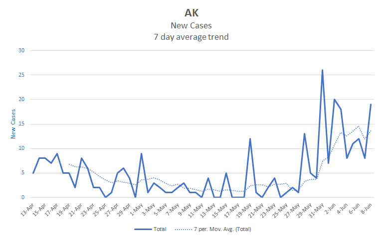
Alaska
Alaska is definitely increasing. However, its average is still less than 15 cases per day. Given it’s low population density, I don’t think it is likely to rise high enough to significantly impact the national numbers. With that said, if I lived in Alaska, I would start paying attention to where those cases are and act accordingly. Outbreaks can be locally very serious even when they aren’t large by national standards.
Kentucky
Kentucky has been rising, but not much overall. Its 7 day average has consistently been in the 100 to 200 range for the last two months and is now just above 200. You can see the last two weeks as an alarming increase or simply as reversion to the mean. It’s one I’m keeping an eye on, but to my eye it’s not yet outside of its usual behavior.

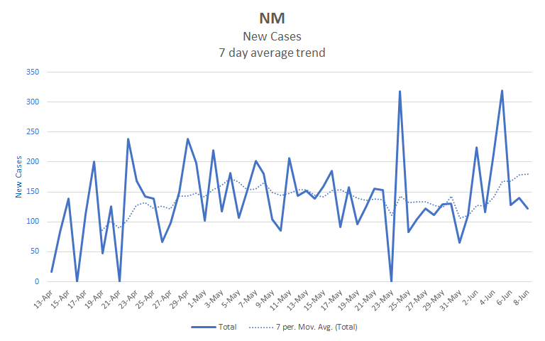
New Mexico
New Mexico is in a similar situation as Kentucky. Its rising, but is not yet much above where it’s been since late April.
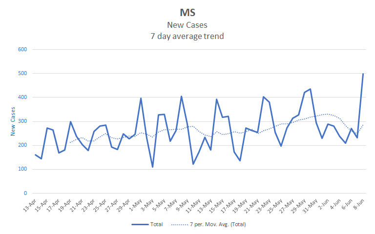
Mississippi
Mississippi is a little different. It’s been rising all along and has largely been continuing to do so. Its average has recently been around 300 cases per day. On the other hand, there are some recent dips in the numbers. If it continues to rise, or begins accelerating, it could be worrisome, but I don’t think it’s there yet.
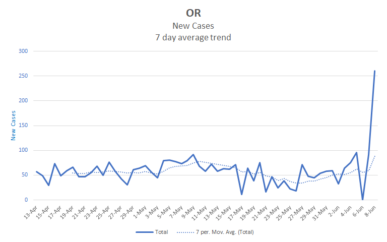
Oregon
Oregon is another case where the numbers aren’t really out of its usual range. It had a huge spike in cases yesterday, about three times its recent numbers, and that pushed its average up a lot. However, spikes like that aren’t uncommon in the data and generally don’t really indicate an ongoing change. Still, it’s numbers have been recently rising and it wouldn’t surprise me if they continue to do so.
South Carolina
South Carolina has been rising since mid May. Looking at the trendline, it can seem like it has been accelerating recently. However, there has been a lot of noise in its data. You can see that within the last week, there have been 3 days with no new reported cases, and 2 days that are several times its usual rate. As a result of the noise, I’m less inclined to trust that the trendline is predictive. I want to understand what’s causing the sudden noise or see the trend continue before I raise the alarm. It’s definitely one to watch.

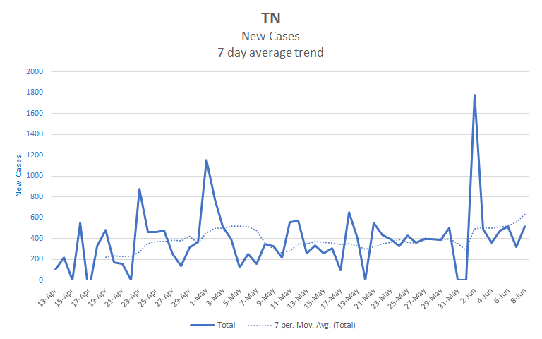
Tennessee
Tennessee is another state that is largely just continuing it’s trend. It has been rising steadily since early May with some recent acceleration. Like South Carolina, its had some recent noise in its data that concerns me and makes me less trustful of the trendline. That last rise in the trendline at the right side of the chart is really just the two days of reporting 0 cases falling out of the 7 day window. Since the spike is still included, the 7 day average jumps. I’m going to wait to see what the next week brings to be concerned here.
Utah
I almost included Utah in my list yesterday. You can see that its numbers have risen suddenly over the last two weeks, with the 7 day average more than doubling in that period.. This is definitely cause for concern. There are two reasons I decided not to include it. First, there is a definite pattern over the last two weeks that is different than anything else in the chart. That might mean that there is a definite change in the behavior of the pandemic there, or it might indicate some change in how the state is processing numbers. Second, as worrisome as the chart looks, it seems to be to be less worrisome than the 6 I did list. One has to draw a line somewhere, and I drew it above Utah rather than below. Still, Utah is easily the most worrisome state detailed in this post.

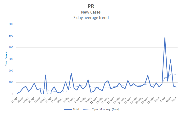
Puerto Rico
Puerto Rico’s numbers have just recently changed. The chart looks like a slow steady rise with a sudden jump at the end. Sudden jumps tend to revert to the mean and not be significant in the long term. Whether that will happen in this case remains to be seen. This next week should let us know how concerned to be.
Stay safe, and remember that just because an activity is now allowed it doesn’t follow that it is fully safe. I still recommend taking as few risks as you reasonably can. Everyone’s situation is different, so I won’t pretend to know what risks are reasonable for others, but let’s all try not to be foolhardy.