
In January, we heard about the virus. In February, it landed on our shores. March saw the beginning of the exponential explosion. In April, the growth seemed to reach a plateau. What will May bring?
May depends on the balance of three things: The infectious pressure of the virus, the effects of social distancing, and the interplay of the many local outbreaks.
The first of these is easy. In March and April we saw how quickly the virus spreads when left alone, and how lethal it can be. Since early April it has caused roughly as many deaths as Cancer and Heart Disease typically do. ( https://public.flourish.studio/visualisation/1879130/ ) The virus hasn’t changed. We know what to expect on this front.
Social distancing is a bit trickier. We’ve seen that social distancing can have large effects on the spread of COVID. However, we don’t know to what level social distancing will be practiced in May. Many states will reopen to some extent. While we know that full lockdown has a strong effect on growth rates, we don’t know what effect more moderate measures will have. The effects will probably not scale linearly, i.e. if we decrease social distancing measure by 20%, we will probably see more than a 20% decrease in containment. Growth rates will definitely increase as areas reopen, but we don’t know how much. (Note: There’s a worry here about correlation vs causation. We know that the growth of cases slowed over April, but we can’t be 100% sure it was from social distancing rather than, say, the warming of Spring. I think we’re justified in treating it as causation because the results match well with the effects predicted by epidemiological theory and there are plenty of cases that don’t match alternative explanations, e.g. the rapid growth in warmer countries. So while we can’t prove that social distancing is the cause, it’s the best explanation currently available.)
The third is even harder. We tend to think of the US as a single outbreak of the virus. All of the major trackers have topline numbers about how many cases and deaths there are in the US. However, the US has many different outbreaks that interact with each other. It’s common to see state numbers, but even this doesn’t adequately capture the situation. For example, the outbreaks in New York and New Jersey were both likely part of the same outbreak concentrated in New York CIty, while the spread of the virus in, say, Rochester, NY probably had little to do with it. In fact, the plateau we have seen over the last week is only a plateau when you look at averages. Once you drill down a bit, it looks quite different. Here’s how:
Let’s start by looking at the nation as a whole. Here’s a graph of the new daily cases and deaths for the US. Cases are in blue, deaths in red.
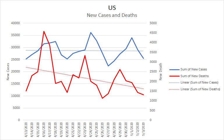
The trendline for cases is close to flat and that for deaths is declining. One can read this chart as indicating that we are at or just past the peak and so to support the idea of careful reopening. However, this reading misses important parts of the story.
New York state has had an outsized impact on national numbers. Currently, it accounts for about a quarter of all cases and a third of all deaths. It has also been aggressive in implementing social distancing. Let’s look at the effect that has had. As I mentioned earlier, the outbreak spreads to New Jersey, so we should include it. Here’s the same graph looking only at New York and New Jersey.
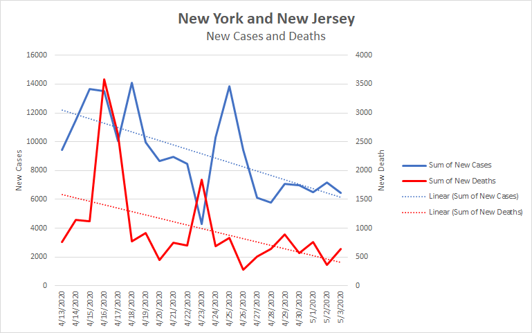
In this graph, both cases and deaths are dropping pretty quickly. Cases and deaths per day have fallen by about half over the last 4 weeks. Given New York’s impact on the numbers, if its numbers are falling faster than the nation as a whole, then the rest of the nation must be doing less well than the first chart indicated.
Here is the same graph looking at the US without New York and New Jersey.

Now we see that cases in the rest of the country are rising and deaths are flat. In fact, this graph is likely a bit optimistic as it ends on a Sunday, which is the low point in the weekly cycle. If I had ended the graph on Saturday, the trendline for deaths would be rising and the trendline for cases would be steeper.
So as New York has gotten its outbreak increasingly under control, the virus has increased in other areas to make up the difference.What appeared to be the country as a whole at a turning point is really just one or a few states doing well while infections rise in the rest of the country. The data we’ve seen even gives us a hint about which state might be driving the infections. For example, there is another outbreak centered around the Washington DC metropolitan area. It impacts the numbers for Maryland and Virginia as well. Here is a graph of that area.
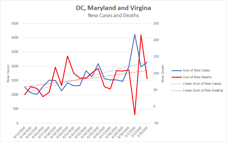
While it’s not the scale of the New York City outbreak, both cases and deaths are growing. Finally, let’s look at a state where social distancing is being relaxed and which has the population to create a real impact, Texas, the second most populous state in the country.
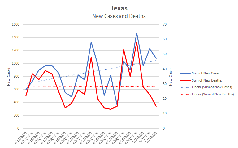
Here we see the cases growing and the deaths flat. Again, the flatness of the deaths trendline has a fair bit to do with ending on a low point in the weekly cycle. Had I ended the graph yesterday, it would have been rising. As social distancing is relaxed in Texas, we expect these numbers to increase. We just don’t know by how much.
So what does it all mean for May? Here’s my best guess.
Relaxed social distancing will allow the virus to spread more quickly and will result in more deaths. Keep in mind that it takes a couple of weeks for this to show up in the numbers and it would take a couple more weeks to see the effect of any tightening of restrictions as a result. There will be substantial political pressure not to reimpose restrictions, so in places that are relaxing, I expect to see increasing numbers throughout May.
On the other hand, the areas that have most impacted the national numbers are continuing social distancing and will likely continue to do so through most of May, so their numbers will come down. This should balance the increasing numbers from elsewhere.
This means that May will likely be a continued plateau, though probably a bumpy one. We’re currently seeing about 2000 deaths and 28,000 new cases per day, with death in decline and cases flat. In round numbers, if things balance out, I expect in the neighborhood of 40,000 more deaths in May and 700,000 new cases. Added to our current numbers and rounding heavily, that has us ending May at roughly 2 million cases and 100,000 deaths.
Those are, of course, very rough numbers based on several assumptions. I mean only to give a general prognosis, not an accurate forecast. To me, May looks about the same as the last two weeks. That’s not pretty, but it’s not as bad as it could be.