There are a number of things to talk about before we get to a projection.
Reopening
We’re seeing an increasing number of places relax social distancing rules. This will almost undoubtedly have an effect on the spread of the virus, but that effect won’t show up for a bit. Because we don’t have widespread testing yet, we won’t know about new infections until people start showing symptoms. That takes about 5 days after infection. We also have to wait for there to be enough increase in the spreading to be noticeable against the usual variation in the new case numbers. Because social distancing is only being relaxed rather than completely removed, that will take a bit. I wouldn’t expect to see any noticeable change for at least two weeks. If you think back on how long it took to see the effect of social distancing in the first place, we expect it to be at least that long to see the effect of relaxing it.
Treatments and Vaccines
There’s been a lot of talk about treatments and vaccines lately, including Dr. Fauci commenting on some positive results from remdesivir. There are indeed several candidates progressing quickly through the testing phases. If everything goes perfectly for the fastest of these, we could see something new on the shelves by sometime in early fall. Remember that it will take time to scale up production to levels capable of vaccinating/treating a large number of people.
Existing drugs, such as remdesivir have two advantages. They’ve already passed the safety stage of testing and they already have significant production facilities. This means they could be in use very quickly. The downside is that because they were designed to be effective against COVID, they probably won’t be hugely effective. We saw that the initial hype about hydroxychloroquine turned out to be overblown and there is some reason to think the same may happen with remdesivir. We don’t yet have the study details that Dr. Fauci referred to, but it looks like any effect is primarily to reduce hospital stays by a few days rather than to improve final outcomes. That’s not nothing, but it’s not a game changer.
In full disclosure, my analysis of pharmaceutical information relies heavily on Derek Lowe’s excellent blog. I highly recommend it if you find these sorts of issues interesting.
Mortality and Misinformation
There’s still a lot of talk about what the fatality rate of the virus is. As you read about that, keep in mind that “fatality rate” can mean a lot of different things. A lot of misinformation arises from not being careful about these.
Fatality rates (sometimes called mortality rates) are just the number of deaths compared to some other number. There are a lot of interesting numbers to compare. Here are three:
Case fatality rate = # of deaths / # of cases presenting for treatment
Infection fatality rate = # of deaths / # of infections
Population fatality rate = # of deaths / # of people in the region
Case fatality rate will always be the largest of these three and population fatality rate will be the smallest. I’ve seen people argue that COVID is no worse than the flu by comparing COVID’s case fatality rate to the flu’s infection fatality rate. If you hear someone compare fatality rates, you should immediately ask whether they are comparing the same type of fatality rate. There’s a video making the rounds featuring two doctors that is particularly bad in this regard and several others. It was bad enough to draw a public rebuke from their professional societies.
*Projection*
Just as a reminder, I’ve switched to the Johns Hopkins tracker as the basis for these projections.
I want to point out some improvements we’ve seen over the last couple of weeks. If we focus on how many new cases and deaths there are each day, it’s easier to see that we’re making progress. Here’s a graph showing the data.
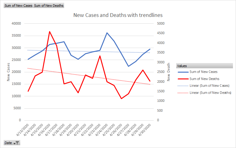
The dotted lines indicate the general trend of the data and they’re both headed downhill. In reading the graph, be aware that the red and blue lines use different scales. The blue line is cases and uses the scale on the left side of the graph. The red line is death and uses the scale on the right side of the graph. The fact the the red line crosses the blue line does NOT mean that we had more new deaths than new cases on that day.
Using different scales helps us to see the similar patterns in the two lines. Notice that they each have peaks and valleys about every 7 days, but that they aren’t perfectly in sync. The peaks and valleys of the red line occur about a day before those of the blue line. That may or may not mean anything significant for our purposes, I need to get more data loaded in before we’ll know. Still, it’s interesting to see.
I’m also going to take a different approach in generating the projection. Now that I have a more robust data set to work with, I’m going to try out some different projection algorithms rather than just the simple ones I have used so far. Because I’m only projecting out 10 days, and I revise the projection every few days, I don’t expect this to have a lot of impact on accuracy.
For today, I’m using a method that tries to capture the weekly cycles in the data and isn’t strictly linear. So I’m not just adding the same number of cases or percentage of deaths each day. (If you’re an Excel geek, I’m using FORECAST.ETS.)
Here’s what the numbers look like through the 10th.
| Day | Cases | Deaths |
| 4/30 | 1,069,424 | 62,996 |
| 5/1 | 1,107,113 | 64,316 |
| 5/2 | 1,138,795 | 66,345 |
| 5/3 | 1,166,060 | 68,375 |
| 5/4 | 1,190,929 | 70,404 |
| 5/5 | 1,217,621 | 72,434 |
| 5/6 | 1,245,892 | 74,463 |
| 5/7 | 1,275,961 | 76,493 |
| 5/8 | 1,310,529 | 78,522 |
| 5/9 | 1,342,212 | 80,552 |
| 5/10 | 1,369,477 | 82,581 |
Remember, that these are just projecting what’s happened during the last couple of weeks forward for the next 10 days. If testing ramps up considerably, or if infections had a substantial decline a week ago, that will change things. In fact this way of projecting is only about the shape of the lines, I’m not modelling anything about the virus itself, just the reported numbers. I would say more about how it compares to other modelling techniques, but this is already a long post, so I’ll save it for another day.
Remember that although we’re making progress, the numbers would be much higher without social distancing. Keep at it.