
Daily case counts in the US continue to rise and to accelerate. Our current levels are about the same as they were in early August. Here is the national graph.

You can see the blue line rising at the right side of the graph. The fact that the line not only rises but is cupped upwards indicates that the rise is accelerating. Of course we don’t know how long the rise will continue, but given that we started about 20,000 cases per day ahead of the previous rise, it seems likely that we will go substantially beyond the previous peak.
If you haven’t seen it yet, the New York Times has an excellent historical comparison of how the distribution of cases has changed over time. It’s at https://www.nytimes.com/interactive/2020/10/15/us/coronavirus-cases-us-surge.html . It’s definitely worth looking at the comparisons. Here, for example, is the presentation of the distribution as of October 13. In this graphic, the height of the red triangles represents cases per thousand inhabitants rather than the raw number of cases.

The analysis presented by the Times is great, as usual, but there is one issue where I would disagree with them. The Times says that the current peak is geographically concentrated in the upper midwest. I think that misses some important features and understates the true spread of this surge.
First, there is still an awful lot of virus in the lower midwest and the south. Kentucky, Tennessee, and Missouri don’t look good in this graphic. It’s true that the south has improved since the last peak, but it still has a long way to go and is not currently further reducing daily caseloads. Yes, the upper midwest, and Wisconsin in particular, are hard hit. But so are areas further south.
Second, there is quite a lot of virus throughout the great plains, from North Dakota all the way down into northern Texas. Because these areas are less densely populated overall, we don’t see the deep red blotches from overlapping triangles as much as we may elsewhere, but the triangles are actually higher, indicating higher per capita levels of infection.
Finally, notice that some of the highest triangles are in Montana. Again, because this area is so sparsely populated in general, there aren’t as many triangles overall, but on a per capita basis, Montana, Idaho, and Utah are not doing very well at all.
So to my eye, this surge is actually quite broad, extending from Virginia to Utah and from the Dakotas to the northernmost areas of the South.
The vast difference in population density between the western and eastern portions of the US is often underappreciated unless you have lived in both. I grew up in western Washington state doing a lot of hiking. It was pretty easy to find a 50 mile hike that didn’t cross any roads or other signs of civilization. The situation was quite different in southern Indiana where I went to grad school. I remember trying how difficult it was to simply find a place to camp that wasn’t in a fully developed campground. There was no hope of a long wilderness hike. Southern Indiana is not densely populated by eastern standards, but it bordered on being a megalopolis by my western ones. This difference in density shows up in analytic maps a lot. Here’s another from the New York Times’ main COVID page.
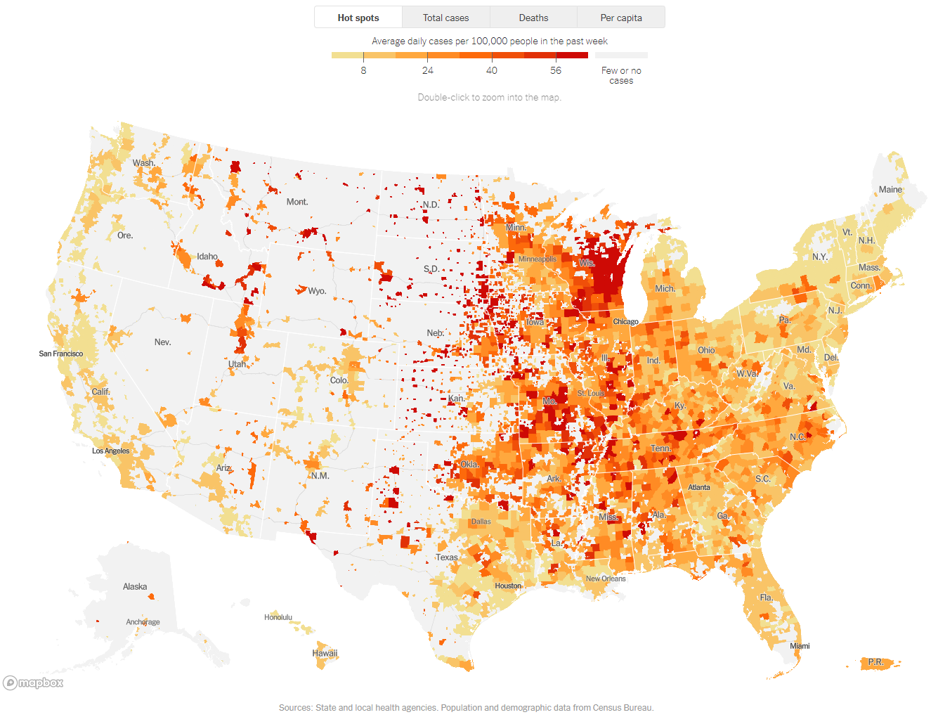
Notice all of the gray area in the west. It gives the appearance that, say, Montana is in better shape than pretty much anywhere in the eastern US. However, this impression is largely an artifact of choices made in constructing the map. One choice is that while the statistics are reported by counties, the color is applied only to populated areas within the counties. In the east, where counties are small and there are very few unpopulated stretches, this results in fully colored areas. Here, for example, is the same map zoomed in to Indiana and Ohio. You can easily make out the individual counties here, there are very few uncolored areas. Notice also that there are very few dark red areas.

Now let’s compare that to the same size area around the border of Montana and the Dakotas.
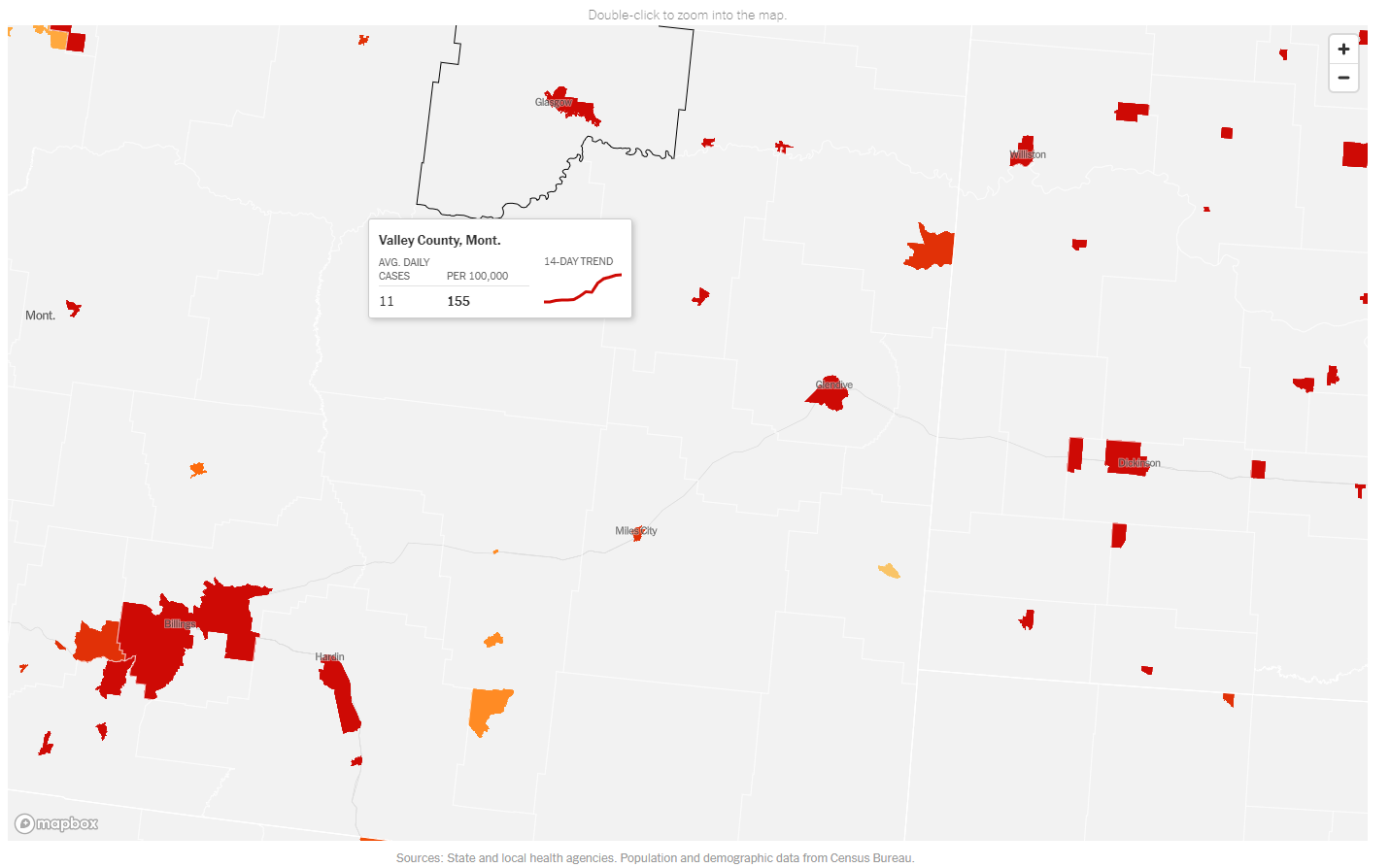
Here we see mostly gray. I’ve left one county highlighted so that you can easily see that it is a mix of gray and dark red. 155 cases per 100,000 is very high. However, the map appears less alarming than the previous one because there is so much gray area with no reported cases. What isn’t conveyed is that those areas are gray because almost nobody lives there. The county as a whole has a population of under 7,500 with almost half of those living in the town of Glasgow and the rest spread out over the remaining 5,000+ square miles of the county.
What we should be taking away from these two map zooms is that nearly every populated area in eastern Montana and the western Dakotas has alarmingly high levels of infection, higher than you would likely encounter anywhere in Indiana or Ohio. I don’t think the full map adequately conveys the levels of infection in the intermountain West. In this case, the graphs are better. Here, for example, is what we see for Montana.
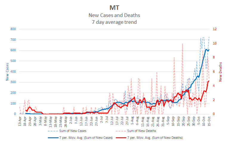
When adjusted for population, Montana has a higher rate of infection than Wisconsin and much, much higher than Ohio.
So, overall, we’re headed for a new peak which is likely to be higher than the last one. Infection rates are high across a wide swath of the US including both urban and rural areas. Some areas that were hard hit in the second surge seem to be holding their own, but others from the first surge are rising again. It’s hard to know exactly how this all plays out, but I would bet that we’ll end up substantially higher than the last surge.