
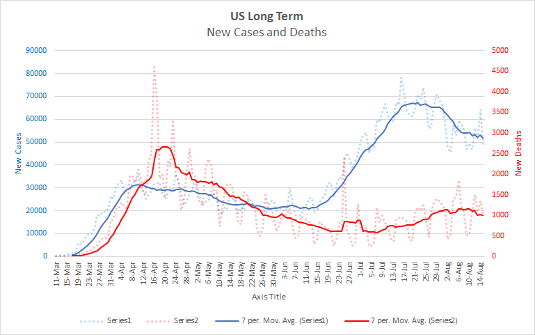
The big picture on reported numbers is pretty clear. After peaking in late July, reported cases are starting to stabilize at about twice the level of the previous cycle. April and May saw an average of between 20 and 30 thousand cases per day. We seem to be levelling off in the vicinity of 50 thousand. We’re doing comparatively better with regards to deaths. We seem to have peaked at about 1100 deaths per day and are starting to decline a bit, though our 7 day average remains above 1000. It remains to be seen how much we’ll decline, and over what period, but the number of daily deaths is overall much improved compared to April and May. Here is the long term graph for the US so you can see what I mean.
If the pattern continues, we should expect another increase in late September or early October. That will be complicated by the onset of flu season for a variety of reasons. Flu season generally sees an increase in hospitalizations which will put extra pressure on medical systems. People may also be more reluctant to get a flu shot during a COVID resurgence further exacerbating the problem. If this happens to be a bad flu season (and the way 2020 is going who would be surprised?), the combination of these factors could be deadly. On the other hand, with a lot of people socially distancing and wearing masks, the flu season could turn out to be milder than it otherwise would be. We also don’t know how the flu and COVID might interact. Does having the flu make one more or less susceptible to getting COVID? What about the converse? What happens if someone has both? Given the similarity of symptoms and the limitations of testing for each, will COVID cases be over or under reported? Etc. Still, I would plan for another spike this fall even though there is a lot of uncertainty about the severity of it.
***Thinking about Testing Rates***
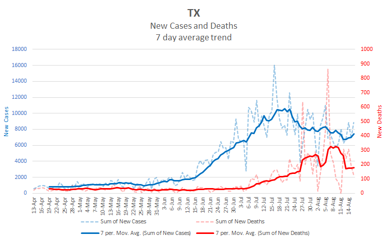
There have been some issues with testing rates. Specifically, testing rates have fallen off dramatically in some places and there is a high probability that this has affected the number of reported cases. Texas is the easiest place to see this. First look at this graph of Texas’ reported numbers.
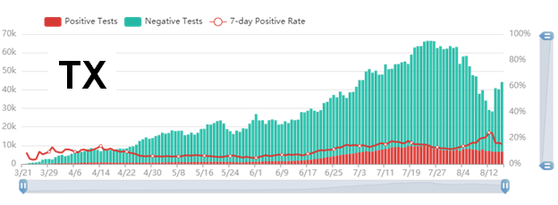
And now have a look at Texas’ testing graph (from 1point3acres)
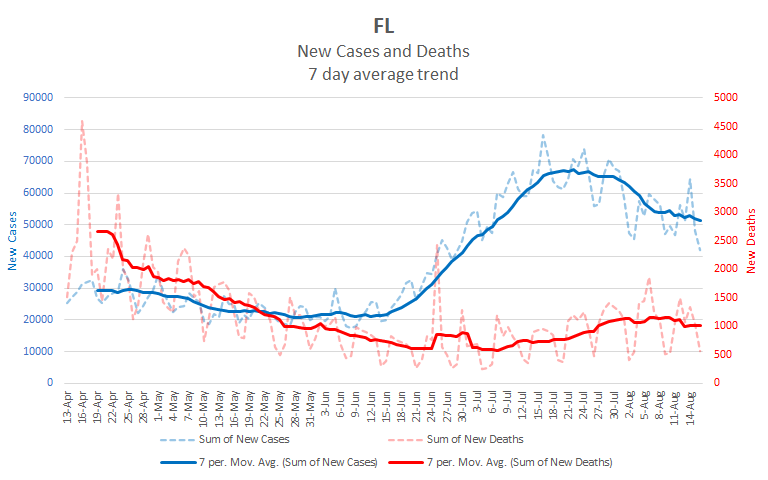
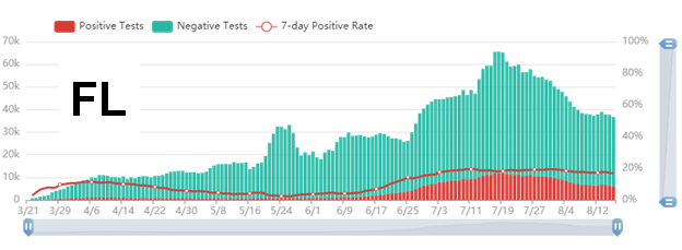
As you can see, Texas’ testing levels have dropped off sharply during the same period that its case numbers have declined. Texas isn’t alone in this. Here are Florida’s case and testing charts. You can see that testing has fallen off there also.
It’s worth exploring how testing rates impact reported cases. The relationship is not as simple as it might first seem.
We’ve all heard Trump say that we have a lot of cases because we do a lot of testing. The idea behind this claim is basically sound. If there is some level of infection in the community, then more testing will tend to find more cases. But while this idea is a reasonable rule of thumb, the details matter an awful lot.
If we were testing a random sample of people, we could just look at the rate of positive tests. Whatever percent of tests were positive, that percent of the overall population would be infected. Testing more or less, within limits, wouldn’t really matter. But we aren’t testing random samples, so it’s much more difficult to know the relationship between reported cases and actual cases. All sorts of factors influence whether a person gets tested for COVID. In fact, there have been some fierce critiques of recent studies about COVID that were based on improper sampling. To understand how Texas’ and Florida’s decrease in testing relate to their reported cases, we have to make some educated guesses about who is being tested.
**Florida**
We’ll start with Florida as it is the cleaner of the two cases. Notice that the rate of positive tests has been about the same, around 18%, since the end of June. In Florida the chance that a given test will be positive is the same regardless of how much testing is done. In stats-speak we would say that the positivity rate is independent of the testing rate. There are a couple of explanations that fit with this.
One is that Florida’s infection rate has remained relatively constant over that period. If Florida’s infection rate has been constant, and if the people being tested are similarly representative over that same period, then we would see just what the graph presents: a constant positive rate with infection numbers going up and down as tests do. On this scenario, Florida has just as many cases as it did in mid July, they are only reporting less because they are testing less.
However, another possibility is that Florida’s testing protocols are linked to the chance of someone being infected. This might happen if Florida only tests people who have symptoms, but encourages all such people to get tested. We would expect that as infection rates increased, more people would show symptoms and so more people would get tested. When infection rates decrease, there would be fewer people tested because fewer people would have symptoms. The rate would be constant, because showing symptoms correlates to a certain percent chance of being infected, but the infection rate really would be dropping. While possible, this scenario seems less likely to me as it would involve Florida having really figured out how to very effectively focus their testing. If we really knew how to do that, I would expect the practice to be more widespread.
I don’t have conclusive evidence about which of these cases applies to Florida, or whether some other explanation which I haven’t considered does. One would need to look at how Florida decides who gets tested, and would then need to spend some time thinking about how that fits with the reported numbers, to make a good guess. Still, it’s fair to be concerned about whether the drop in Florida’s reported cases is just an illusion. Absent evidence to the contrary, I would lean toward thinking that Florida’s cases haven’t really dropped much. This is based not only on the testing charts, but also on the fact that Florida’s daily deaths haven’t really started to decrease yet, though we’re a month past their peak reported cases.
**Texas**
Texas is a very different case. It’s testing numbers look pretty unremarkable through July. The positivity rate increases as testing also increases from mid June through mid July. This is just what we expect when actual cases are rising rapidly. In the second half of July, the positivity rate starts dropping while the test numbers remain constant. That’s just what we would expect as an outbreak starts to fade. But then we get this period where the testing rate decreases rapidly while the positivity rate increases rapidly. And when testing increases right at the end, the positivity rate decreases. Here again, there are two possibilities.
The most straightforward explanation here is that a significant portion of Texas’ drop in reported case numbers is due to restricted testing rather than decreased infections. When tests are artificially restricted, the sickest people are the most likely to get tested. If we assume that the people most likely to have COVID, e.g. those with the most severe symptoms, are also the most likely to be tested, then decreasing the amount of available testing will show a higher positivity rate. By restricting testing, you end up focusing more on those who are very likely to have COVID and miss those who have were less likely to have it but still do.Since this is what we see, it’s not unreasonable to see Texas’ drop in cases as illusory.
Another alternative is that Texas has managed to figure out how to closely target its tests to those who have COVID, and that nearly everyone who has COVID is tested. On this view higher and lower amounts of testing really are a matter of whether people are getting tested for their own peace of mind and not because they likely have COVID. The best argument for this is that the number of positive tests is relatively constant even when the testing numbers and positivity rates changed wildly. On the 13th of August, Texas had 28,000 tests of which 6700 were positive, a positivity rate of 24%. The next day, there were 41,000 tests, 6600 of which were positive for a positivity rate of 16%. The number of positive tests stayed about the same for both days. Still, this scenario requires that Texas has managed to precisely target it’s testing regime to those who really do have COVID. While possible, it is prima facie less likely than the first scenario.
Here again, we don’t have conclusive evidence of what’s going on. Of course, it may be a mix of both scenarios with some others we haven’t considered. But in the absence of clear evidence, it makes sense to think the simpler explanation is the more likely one.
Overall, the fact that testing is so variable in these high number states is worrisome. It makes it much more difficult to see the reported numbers as helping us to at least understand whether real cases are rising or falling. Untangling all of this requires more time, effort, and access than I have available. I would expect there are people doing it, so keep your eye out for stories along these lines.
***Projection***
Here’s a view of what the next 10 days may look like at the national level.
| Day | Cases | Deaths |
| 8/16 | 5,403,061 | 170,049 |
| 8/17 | 5,453,728 | 170,670 |
| 8/18 | 5,504,395 | 171,289 |
| 8/19 | 5,555,062 | 171,909 |
| 8/20 | 5,605,729 | 172,529 |
| 8/21 | 5,656,396 | 173,149 |
| 8/22 | 5,707,063 | 173,768 |
| 8/23 | 5,757,730 | 174,388 |
| 8/24 | 5,808,397 | 175,008 |
| 8/25 | 5,859,064 | 175,628 |
| 8/26 | 5,909,731 | 176,247 |
Thanks for reading.