
Yesterday’s new cases and deaths were the lowest we’ve seen in a long time. On the Johns Hopkins tracker, there were 19,710 new cases and 731 deaths on May 10. These are the lowest numbers we’ve seen since the end of March. If that sounds like great news, it is. However, it’s worth digging into the numbers a bit to better understand what’s going on.
Sundays
The first thing to notice is that this was a sudden drop and not the result of a gradual slide. Compared to the day before, new cases dropped by 23% and deaths dropped by 55%! Those are huge single day drops. You can see this in the chart below.
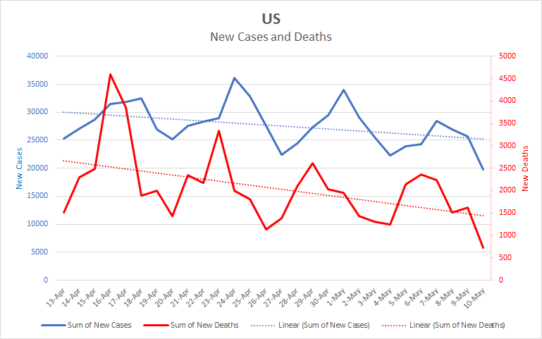
When presented this way, the weekly cycle is very clear. Of course the virus doesn’t care about the day of the week, so this cycle probably reflects reporting differences. Sundays tend to be a low point. I don’t see a similar cycle in the number of people tested or hospitalized, so this most likely has to do with the work cycle of those doing the recording and reporting. The strength of the cycle varies by state. New York doesn’t show a strong weekly cycle, but states such as Georgia, Illinois, and Texas do show strong cycles. So one reason yesterday was low is just that it was a Sunday.
Mother’s Day
Still, this was a large drop even for a Sunday. Another possibility is that the reporting was extra low due to it being not just Sunday, but Mother’s Day. If fewer cases and deaths are reported on Sundays, it makes sense that the reporting might be even lower on holidays that fall on a Sunday. Here is a longer version of the graph with New York and New Jersey dropped out to make the effect of the weekly cycle clearer.
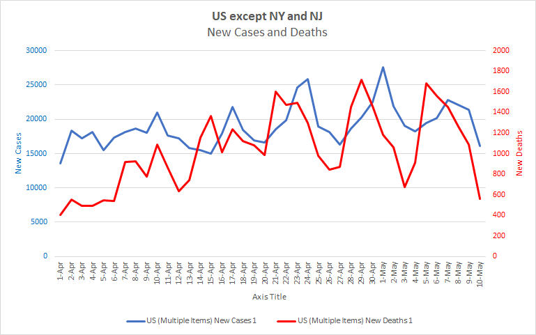
You can see that on April 12th there was another huge drop in deaths. That was Easter, which adds support to the idea that holidays may further reduce reporting.
An interesting thing is that once New York and New Jersey are removed from the data, the weekly cycle seems to be growing more extreme. The difference between the highs and lows of this last week are greater than the difference in the previous week, which in turn are greater than the week before that.
New York’s Declining Influence
Finally, let’s look at the trends for New York and New Jersey compared to the trends for the rest of the country. I’ll look at a shorter time period to make the trends clearer. Here are the charts:
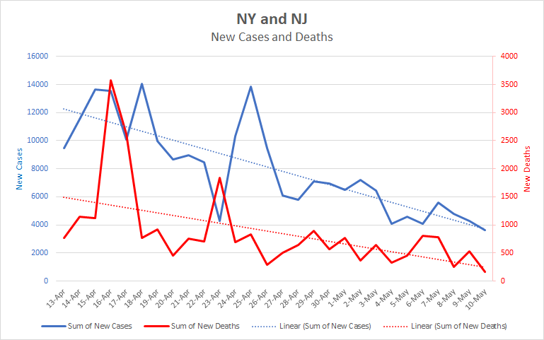
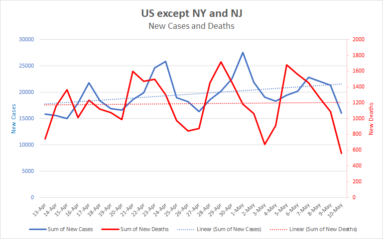
You can see that while New York and New Jersey have been steadily declining, the rest of the country has been steady or increasing. So the influence that New York and New Jersey have on the national totals has been steadily decreasing. Here is a chart showing the percent that these two states have contributed to the nation’s daily numbers over the past 3 weeks. I’ve used a 7 day running average to reduce noise and make the trend clearer.
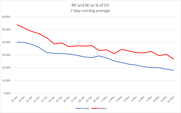
You can see that 3 weeks ago these two states were responsible for more than half of all COVID related deaths in the nation and 40% of all new cases. That percentage contribution has dropped by half since then. Yesterday, NY and NJ were responsible for only 18% of new cases and 23% of new deaths. Remember that New York and New Jersey don’t follow the weekly cycle that we see so strongly in other parts of the nation. That means that as their impact on the numbers decreases, the impact of the weekly cycle increases.
So these three things combine to explain the extremely low national numbers yesterday: It was a Sunday, it was a holiday, and the New York area outbreak is no longer the primary driver of the national numbers. Add in the fact that national numbers have been in a slow decline anyway and you have a perfect setup for some extremely low numbers.
Projection
I expect that over the next week we’ll see the numbers come back up as they follow the usual cycle. The open question is how high they will rise. Without taking reopening into account, I would expect them to look about like last week. NY and NJ are no longer driving the numbers and the remainder of the nation has seen slightly increasing numbers overall. It’s possible that we’ll begin to see some increasing numbers from the reopening in various locations. That depends on social and political factors that I’m in no position to predict. How much will people rush to return to normal? To what extent will political calculation drive how numbers are reported? This latter question is a reminder that all we have here are the reported number, the real number of cases and deaths are undoubtedly much higher.
While we wait to see what changes are in store, here is a projection based on what they’ve been doing over the past few weeks.
| Day | Cases | Deaths |
| 5/10 | 1,329,260 | 79,526 |
| 5/11 | 1,358,026 | 82,051 |
| 5/12 | 1,382,137 | 83,741 |
| 5/13 | 1,406,248 | 85,430 |
| 5/14 | 1,430,359 | 87,120 |
| 5/15 | 1,454,470 | 88,809 |
| 5/16 | 1,478,581 | 90,499 |
| 5/17 | 1,502,692 | 92,188 |
| 5/18 | 1,526,803 | 93,878 |
| 5/19 | 1,550,914 | 95,567 |
| 5/20 | 1,575,025 | 97,257 |